Reframing Muzz's Menu from settings navigation into a personalised engine for discovery, membership and growth.
Role: Product Designer
Platform: Android, iOS
Company: Muzz
Goals
• Transform the Menu into a membership hub for users to manage their subscription and perform basic settings.
• Increase revenue for the business utilising the second most profitable area of the app.
Responsibilities
Stakeholder management, problem definition, metrics, concept, wireframes, dev ready files
Impact
Led the 0→1 design of the Marriage Menu experience, driving product strategy and end-to-end UX in close collaboration with Product, Engineering and Revenue Squad.
Delivered a +12% increase in Menu revenue within two weeks of rollout.
From Menu to Feature Hub
21M+
Worldwide users
2 tiers
Basic, Gold
18+
Features in menu
-
A cluttered menu was hiding the value of Gold membership
The Marriage product's profile menu had grown organically over time; features, settings, upsells, and profile management all competed for attention on a single scrollable screen with no clear hierarchy.
Users struggled to find what they needed, and Gold subscribers in particular couldn't easily see or manage the premium features they were paying for. The result was poor feature discovery and potential churn among Gold members.
-
Led the 0→1 design of the Marriage Menu experience, driving product strategy and end-to-end UX in close collaboration with Product, Engineering and Growth.
-
Muzz is the leading Muslim dating and marriage app, with over 21 million single Muslims looking for love. The platform helps Muslims around the world meet compatible partners and build meaningful relationships, with a focus on marriage, faith, privacy, and safety.
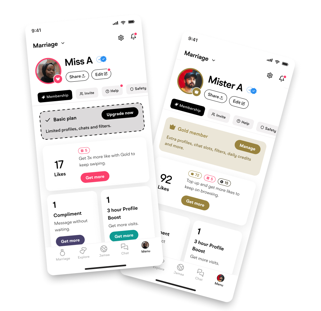
Basic and Gold membership
The Big Opportunity
🗺 No clear hierarchy
Profile actions, upsell cards, feature toggles, and settings were interleaved with no logical grouping.
💎 Buried Gold value
Gold subscribers couldn't see a consolidated view of what they were paying for across Boosts, Likes, and Compliments.
🔍 Feature discovery
Newer features like Browse Privately, Gatekeeper Question, and Custom App Icon had near-zero awareness.
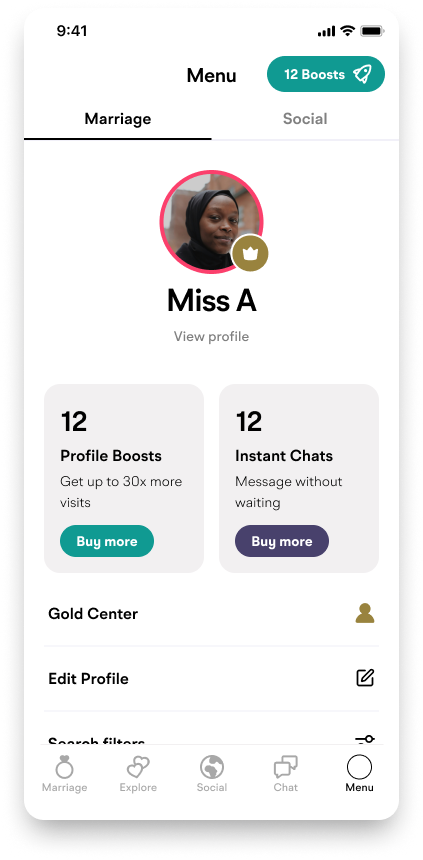
Old Menu design
Purchasing patterns shaped the redesign
Quantitative analysis of consumable purchases revealed a clear and actionable split between men and women in how they bought Boosts and Compliments. The consumables were at the top of the screen before which indicated this was the right place for these to be for both users. To minimise scope the hierarchy is identical across both versions.
From messy IA to a clear, layered structure
01
Information Architecture Audit
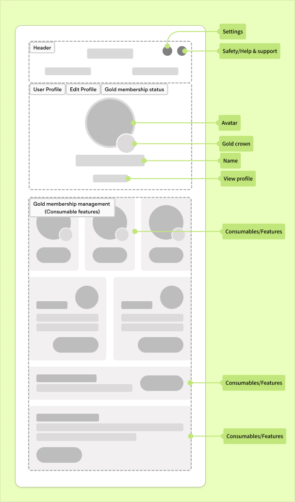
Mapped every item on the existing menu, then clustered by user job-to-be-done. Identified 4 clear zones: Profile, Membership, Features, and Settings.
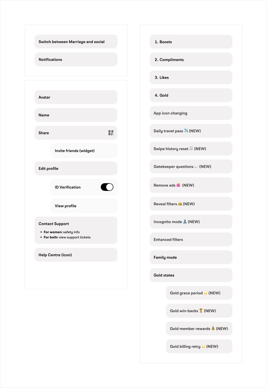
Information architecture
02
Wireframes & Hierarchy Exploration
Low-fidelity explorations testing different orderings of zones, toggle placement, and upsell card positioning.
Wireframes
03
Initial Mid-Fidelity Concepts
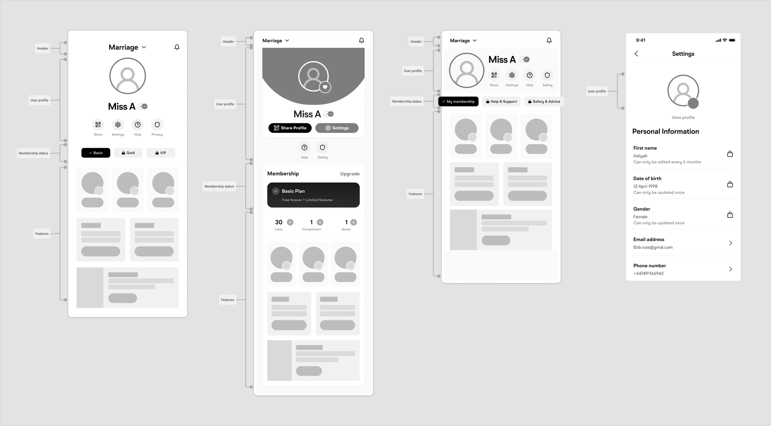
3 directions were explored. Direction C separating profile management from feature management utilised the estate more effectively.
Mid-fidelity
04
High-Fidelity & Handoff
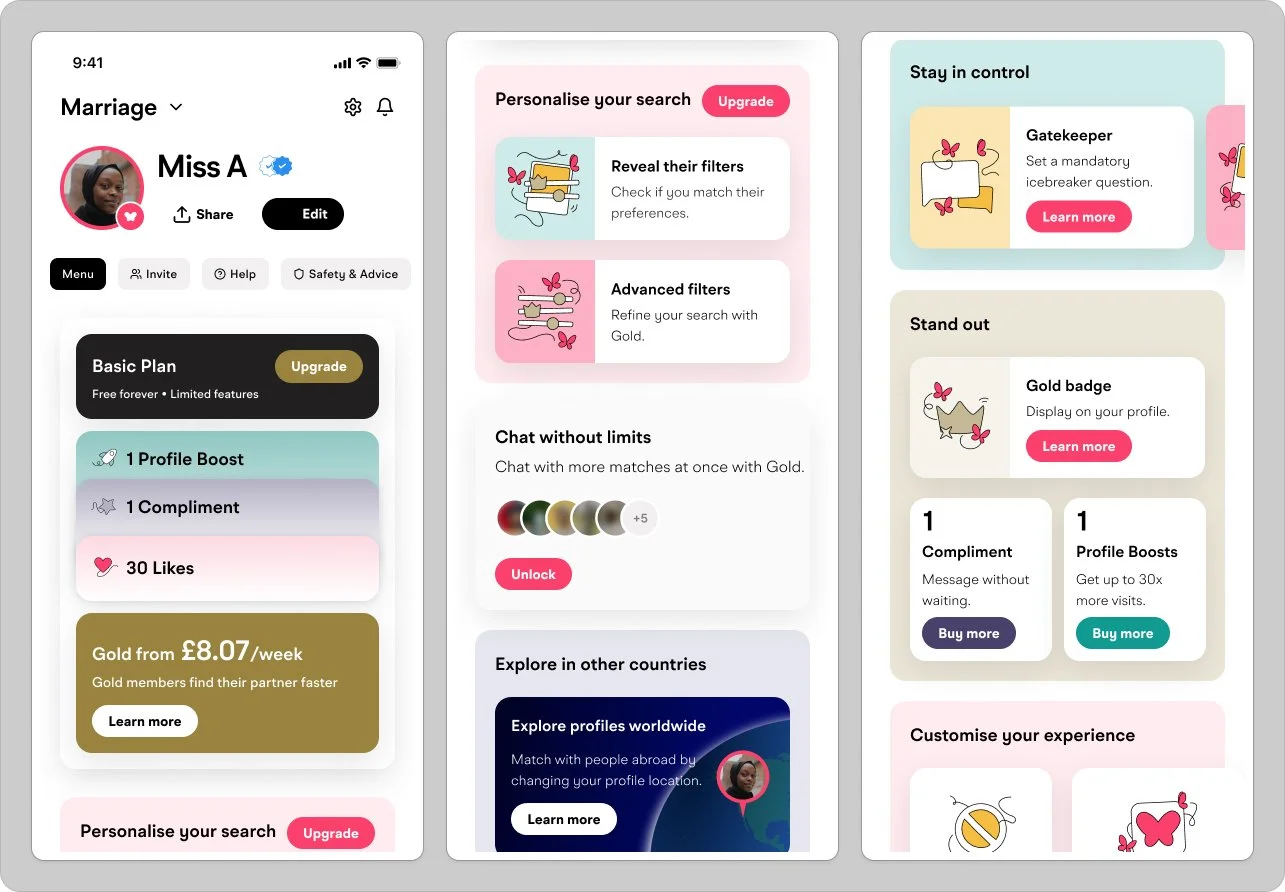
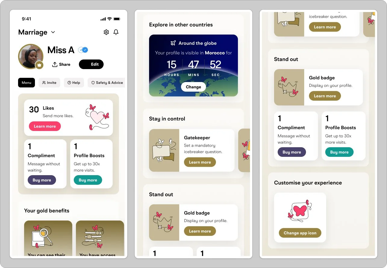
Final screens built with production components from the Muzz design system. Membership state was split into 4 views: Basic Women, Gold Women, Basic Men and Gold Men.
Three concepts, one winner
The team explored three directions in mid-fidelity. The deciding factor on the UI direction was limiting the dev scope.
Option 1
Option 2
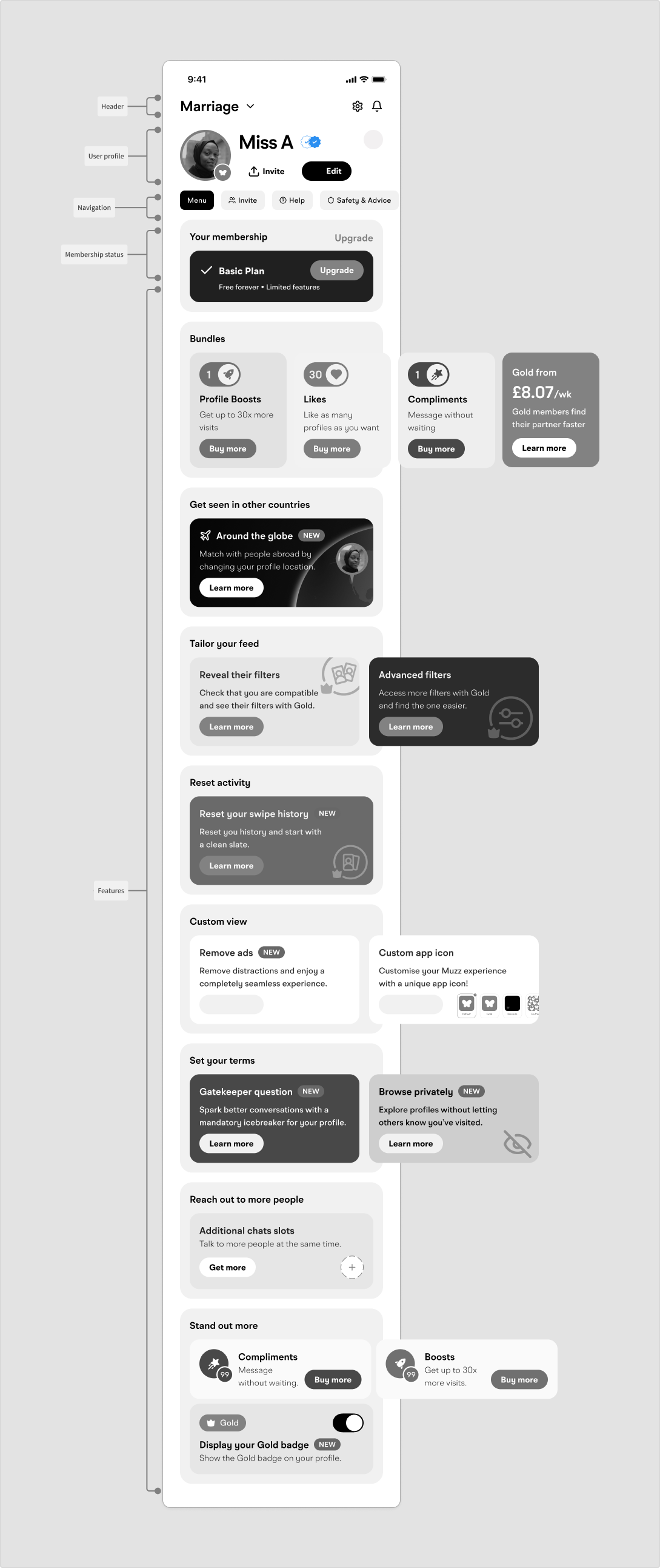
Option 3
💰 More Gold, More Revenue
Overall, in the first 2 weeks post release the Menu redesign is driving:
+12% uplift in Menu revenue, with Menu ARPU and ARPPU both up 7%.
Menu Gold Conversion Rate is also up 9%. Within the new Menu, the top-bar Gold card became a significant Gold conversion entry point, accounting for ~2/3 of Gold upsells on Android post-release.